
Ceramics 1
Ceramics 1
Unity-Principle of Design
Unity-Principle of Design
Unity-Principle of Design
Unity-Principle of Design
Unity-Principle of Design
Unity-Principle of Design


Line- Element of Art
Line- Element of Art
Classwork & assignments
Presentation slideshow
Presentation slideshow
Classwork & assignments
Classwork & assignments
Lines are everywhere. You can see lines in the grain of a piece of wood or in the cracks on a sidewalk.
In art, Line is an element of art that is the path of a moving point through space.
Lines are used to:
-
Create boundaries between shapes
-
Create boundaries between colors, textures or values
-
Lead the eye from one space to another
-
Create textures
-
Suggest emotional qualities


Classwork & assignments
Grid drawing is a very old technique of transferring images (from sketches to a full size canvas or fresco, etc...)
Always make sure that the number of squares on the original picture and your working area are exactly the same (even if the size of the squares are bigger on the paper). This is because no matter how many times bigger (or smaller) you make the drawing, the proportions and dimensions can only stay the same if the number of boxes (squares) matches exactly.
Make sure you follow all steps below.
2.3.2 The Van Eycks and Rogier van der Weyden

Learning targets:
-
Repetition and patterns
-
1-point perspective
-
Establishing a light source and applying value techniques
-
Colored pencils: shading and blending colors
-
Color schemes
We are going to start a free-form pattern design. It is quite simple to draw.
As any pattern, it will have a repeating element, which is going to be a ring or a circle.
Examples


 |  |  |  |
|---|---|---|---|
 |


Directions
Start with drawing circles.
Make them different sizes. They don't have to be aligned.
Draw bigger circles first.
Next fill in the gaps with the smaller ones.

Once the initial circles are there, it’s time to add depth.
Remember linear perspective?
Your stacks of circles will get smaller as they go down and go towards vanishing point near the middle.
If you are not comfortable drawing with a marker or pen right away, use a pencil first.
And as long as you are drawing with a pencil, lightly draw full circles, as if they are transparent.
This way you will get the curves right.


When done - outline all visible parts ONLY with a marker.
Just for fun, try adding a few more floating circles inside.
Complete the drawing in the same manner.
As you draw:
Vary the size of the circles
Bend the stacks to make them more organic and free flowing.


Leave some empty space in the middle.
After the ink is dry, erase all pencil marks.
Next turn the circles into rings.
Start with the top circle. Draw a round hole in it.
Then move on to the next circle.
Add the part that becomes visible. Add a hole to that circle and repeat the steps until you are done with all of them.


Use this same technique in your entire design.
Work with one circle at a time.
Keep close attention to where you draw the lines so you don't get confused.
Before you start coloring, you will add shadows.
To add shadows:
1. Always use logic.
2. Assume the light source is above.
3. Each overlapping shape casts a shadow onto the shape below.
That means that the area next to the edge of the top shape is going to be darker.
4. The shadow fades as it gets away from that edge.
There might be other areas that would not get direct light in your drawing.
Shade them darker as well.


Pick a few colored pencils for each circle.
Coloring tips:
Choose a main color or a mix of colors as a base color.
Use a darker color or black for shadows and a lighter color or white for highlights.
Start with the top circle.
There should be no shadows here since it gets full light exposure.
It is good to mix colors.
You can try and add a highlight to emphasize the contrast.
Color the circle it with a base color.
Lightly shade the area, exposed to light.
Use a darker color for shadows.
Always start at the edge - where the value is the darkest,
then fade it into the main color.
Use a lighter color to blend the lighted areas.
Then use the same approach for the rest of the circles.


Use similar coloring steps and logic for the rings.
This example shows coloring the top ring first.
Move on to the next ring.
- lightly shading with the base color
- Then darker color for shadows, carefully fading into main color.
Again, starting where it is the darkest.
- Then lighter color for highlights.

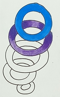


Continue with the rest of the rings.
Before you start coloring have an idea of how you are going to use color in this design.
What do you want to emphasize?
What effect do you want to achieve?
When you are ready,
Start with the top circles and rings or pick a ring stack and work one column at a time.
It does not matter how you start.


Focus on a stack of rings and color them according to your initial ideas and color choices.
In this example the colors are going from blues to purple and reds to oranges.
Then move onto the next stack.
And the next
It may take some time to get through coloring the entire design, but it is a very relaxing and entertaining.
So take your time, get creative and have fun!


For the last step you can also pick a background color that will go well. In this example a blend of dark and light purple was used as the background.
The dark helped to make the rings stand out.
Yellow-orange was also added to the center for interest and contrast. Choose any color that you like.